One of the first things that drew me to Transpire was the brand itself. It seemed really elegant and confident. In the most intangible way, it just gave me a good feeling about the organisation, along with all the conversations and interactions I had. That’s when a brand is at its best – working alongside all other touchpoints to influence the way someone thinks and feels.
Once I started at Transpire as Head of Marketing and began looking at brand management as a whole, it became clear that the brand and the design needed some work. This wasn’t surprising – it was just time. Transpire came into being in 2017, after rebranding from B2Cloud. It’s inevitable that over the years things get a bit loose from a design perspective – people add their own creativity and personal touch to things, which has led to quite a bit of variation in the look of all our designed materials. A lot of it still looked really great, but it wasn’t codified in a way that would make it easy for the whole organisation to use confidently.
With the support of the team and the leadership group, we embarked on a brand refresh earlier this year.
The first step in any process like this was to look at our current situation and figure out what was working and what was not. We did a thorough review of all of our design materials and established some general guiding principles around that direction we wanted to head with this project. We decided early on that we weren’t going to change the name nor the main brand mark, so our scope was language, colours and visual devices.
The next step was to figure out what our visual brand needed to represent. Who is Transpire? And what are the feelings and thoughts that we want our brand to represent? One of the tests we applied was to ask people if someone said Transpire to you in the middle of the night, what is your first thought? Through a series of workshops and exercises with the leadership team, the wider team and consultation with clients and stakeholders, we explored our brand essence. Transpire is a portmanteau of transform & inspire which I think is really beautiful and still has as much impact today as it did in 2017. I really wanted to bring that to the surface, so that people understood where our name came from. When they receive an email from us or bumped into us at an industry event or read about one of our projects – that’s exactly what they think: Transpire is inspiring transformation.
With our brand essence in place, we built this out into a much more comprehensive picture incorporating our key audiences, product attributes, brand benefits, personality and values. In our case, our audiences include both clients and candidates, with the need for a really strong employer brand attracting the best talent being a key part of our future success.
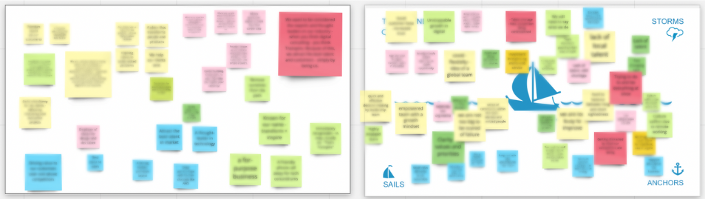
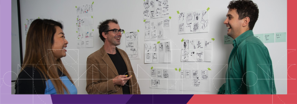
Once we dived into design, we used mood boards to really explore design territories and ideas before going down the path of looking at what it looked like on websites or business cards. Exploring these mood boards was a really interesting exercise and allowed our design team to fully explore their creativity, while we asked ourselves questions such as: are we being bold enough? Are we straying too far from who we are? One early design that we looked at was certainly bold in its approach, but someone noted that we were looking like a company that builds cyborgs rather than mobile applications. Skynet we are not!
A really important lens over this process was our purpose, which is to weave humanity into technology. We used this as another test to question if the designs we were looking at represent a group of people who are working hard to weave humanity into technology.
I won’t sugarcoat it. It was a difficult process. These things are inherently subjective, no matter how scientific we tried to be in our process, the experiments and the feedback cycles. However, one day it clicked. Almost unanimously we all felt that we’d arrived at our new brand design.
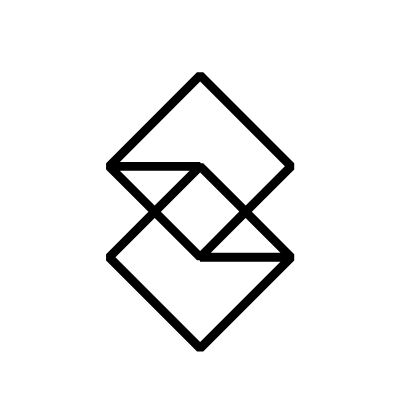
Our logo in mono feels like an evolution to a more mature, confident version of the Transpire that was born in 2017. It’s more flexible and adaptable and can hold its ground amongst any collection of agencies, consultancies, or other leading brands. We’ve simplified our colour palette to focus on an array of purple and the coral that we’ve retained from that previous master logo. A stunning geometric pattern signifies design, building, blueprints and complexity, and various block shapes represent the fact that we’re always building, always improving and always responding to users and their needs and wants.
I’m incredibly proud of the new brand we’re launching today and feel sure that it will hold us in good stead into the future. A big thanks to the Transpire leadership team for their support through this process, the wider transpire team for their commitment and engagement, and for always representing the Transpire brand through their work. And a special thank you to Doug Robb and David Rymarz who have been key allies along this journey.