We all have that annoying friend who encourages you to have one more beer, leading you astray and making you do something you don’t want to do.
Many years ago when working as a digital designer, I was that annoying friend. To stop customers unsubscribing from our mailing list, I was told to make the unsubscribe link tiny and hard to see, so the user would miss the link. I was then asked to create an unsubscribe form for customers to fill in before they could actually unsubscribe from our mailing list.
Customers ended up calling the office to make complaints. The company ended up not only losing customers but they also ruined their reputation. One of the customers called what we were doing ‘dirty marketing’.
That was an unethical act. It was a lesson for me, and I promised myself I’d never trick customers again. Since that day, I’ve paid attention to businesses who do tricky things to customers.
Making users feel bad about their decision
I still remember the days when I still carried an ATM card in my wallet. The 7-11 ATM always asked me to print a receipt to get a slurpee discount. The option is either “Yes please” or “No, I’ll miss out”.
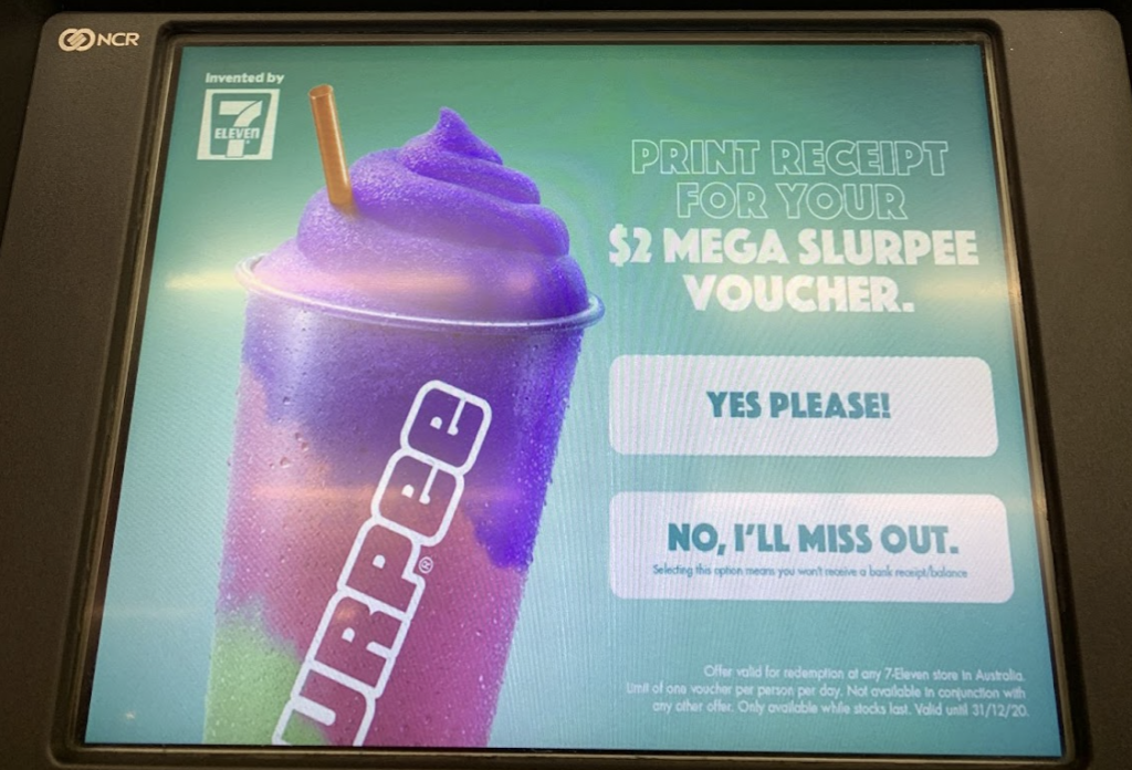
This made me angry every time I saw it. I don’t like wasting paper and didn’t want to print a receipt out, so I tapped on the “No, I’ll miss out!” button. When I hit the button, I felt like I was making the wrong decision.
This type of dark pattern is called confirmshaming – making users feel bad or guilty when opting into or out of something.
Dark patterns – carefully crafted to trick
I have called this kind of unethical practice ‘dirty marketing’ for years until one day, I saw my old UX teacher – Dave, he was running his workshop on dark patterns. I wasn’t quite sure what it was but the name seemed pretty interesting, so I attended. I am so glad I did that workshop, this is the topic I was dying to explore, so thanks Dave.
The term – ‘dark pattern’ (also known as “deceptive design patterns”) was created by Harry Brignull, a British UX designer (PhD Cognitive Science) in August 2010. “A dark pattern is a type of user interface that appears to have been carefully crafted to trick users into doing things that are not in their interest and is usually at their expense.”
Harry explains that the dark pattern is not a mistake, it is a deliberate design that is carefully crafted, with a solid understanding of human psychology, misleading or tricking users to make them do something they don’t want or they didn’t mean to do. He has created create a great website to explain dark patterns / deceptive design.
The roach motel – making it difficult for customers to leave
Another trick I fell into a few days ago is the classic subscription trap on musescore.com – start free 7-day trial’ then $XX a year. I forgot to cancel before the trial ended and I got charged immediately on the 8th day of use. So I was looking for a way to either cancel my yearly subscription or change my subscription from yearly to monthly.
The subscription page wasn’t easy to find, it took me a few goes. I was expecting the subscription option would be under ‘my profile’ or ‘my dashboard’ but it was actually under ‘Setting’. On the subscription page, I was looking for either an ‘unsubscribe’ or ‘cancel subscription’ button and I couldn’t find them anywhere. Then I searched on Google, how to “cancel musescore subscription” and found the answer.
The button I needed to look for was the “End my benefits button”. I finally got out of the maze but I still needed to email the support team to make changes on the subscription.
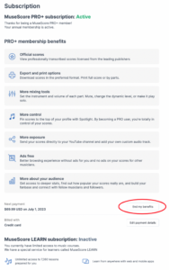
This type of dark pattern is called roach motel: this makes users get into a situation very easily but very hard to get out. This is actually the dark pattern that I used to do, which I mentioned from the very beginning of this article: easy to subscribe and difficult to unsubscribe. I had a taste of my own (former) medicine.
Unsubscribe is like that annoying friend asking you to have one more beer.
How we treat customers leaving is just as important as gaining them. As a designer, we should always respect users, give them the power to make their own decisions, not to trick or force them to do something that they don’t want to do.
It’s our responsibility to help businesses to understand what dark patterns are, how it might upset customers and lead to negative reviews. Dark patterns, I will hunt you down!
From dark to light
Dark patterns are everywhere – many big companies are still using deceptive tricks to manipulate users, get more clicks or sales, without the user’s interests in mind. Good user experience design is not just about providing users with a seamless or easy experience – honesty and transparency also count.
If you have a great product, you shouldn’t be afraid of people leaving it.
Trust in your product. If a company has the resources to invest in the dark pattern, they should be asking themselves if those resources should be reinvested in ethical design, in order to build great long term relationships with users.