In Part 1 we looked at persuasiveness in design and how we use an individual’s mental model to help them complete tasks and how it can be used against them to maximise business objectives. In Part 2 we will look at some of the tools we have at our disposal to mitigate some of the darker practices including my proposed Design Alignment Chart borrowed from Dungeons and Dragons.
Where does a design fall on the continuum and will it do harm?
Moral principles in design
According to Mike Monteiro in his A Designer’s Code of Ethics, it is the duty of the designer to make sure they are designing an ethically responsible product,to advocate on behalf of the user its usability, and to ensure the product is not deceptive in its intent.
As an aside, self-regulation has not been very effective and the speed at which the tech giants have grown has made it extremely difficult for legislation to keep up with the rate of change. As good social citizens we strive to do no harm in all aspects of our lives, this includes the products that we design. However I am uneasy that this responsibility should fall on the designer, and to a lesser extent the product team, to be the moral police. But there doesn’t seem to be an alternative that would be able to work as effectively.
The current economic system is weighted towards working on the edges of ethical practices and the way of working is often to “ask for forgiveness not permission”.
We must ask ourselves the hard questions about whether a design has the potential to do harm or whether an existing design is doing harm, and what steps we will take to minimise this. According to Monteiro, we work and design for the people who use our digital products and as such, have a responsibility to not do harm.
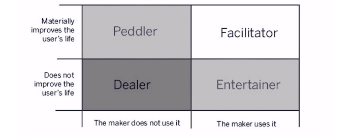
So how do you know if you are making a harmful product? Nir Eyal simply asks: “Would you be comfortable using the product yourself?” Do you use the product and does it improve the user’s life? If not then you are classified as a “Dealer,” and you have to make the decision whether you are comfortable with that or not.
If we wanted to expand on this and try to fill in some of the gray areas, maybe a more detailed matrix might be akin to the Alignment Chart from the tabletop game Dungeons & Dragons. We could use such a chart to map out and navigate the 50 shades of light black.
Design Alignment Chart
The Alignment Chart is a tool that helps you imbue a character with a moral standpoint. This acts as a guide while you are playing the game and shapes your motivations and choices. Where the chart is prescriptive in Dungeons & Dragons, it could become descriptive for our purposes.
The chart is split into Law versus Chaos on the X-axis and Good versus Evil on the Y-axis.
| Law Vs. Chaos | ||||
| Lawful | Neutral | Chaotic | ||
| Good Vs. Evil | Good | Lawful/Good | Neutral/Good | Chaotic/Good |
| Neutral | Lawful/Neutral | Neutral | Chaotic/Neutral | |
| Evil | Lawful/Evil | Neutral/Evil | Chaotic/Evil | |
To make this more applicable for product development, let’s define Good as “Improves the user’s life or the lives of others” and change Evil to “Harmful to the user or others”. We could apply it at a high level when looking at a product as a whole or at a micro level, looking at a design component or flow.
The definition of lawful given here is the adherence to societal law. For our purposes we could also add adherence to certain laws of user experience or heuristics. These would include but not be limited to: consistency, error prevention and recognition rather than recall. (see NN Group’s 10 Usability Heuristics for User Interface Design )
Chaos is a necessary extreme for our continuum and would represent the absence of law.
We will start at defining the high-contrast endpoints as this is a somewhat easier task than defining the gray areas.
Disclaimer: The following examples are all purely subjective and it is a difficult exercise to place examples into discrete boxes. Hopefully, these will act as thought starters with reordering and juggling required after some debate.
I am setting myself up to fail by creating boxes for a continuum, so please see this as a tool to contain these concepts but with the knowledge that they can bleed into one another.
Lawful/Good: Defined as, operating under the confines of the law, with positive outcomes for the user or a third party. This type of website or app would have exemplary levels of beneficial user experience while delivering content that was of high value to the user. An example that comes to mind is https://www.gov.uk/ which won Design of the Year when it was launched – an amazing achievement for an information-rich, jargon-heavy website.
Neutral: A design pattern or UI symbol that is devoid of the necessity for any moral choice. For example, a back button, a drop-down arrow or a close “X”.
Chaotic/Harmful: Operating outside of the law and causing harm. For example, phishing emails that pretend they are a legitimate company, only to steal your identity, hold you to ransom or infect your computer. The outcome is manipulative purely for the benefit of the perpetrator and often the only motivation is to cause harm.
Now to fill in the gaps.
Lawful/Neutral: Purely operating within the confines of the law with little or no agenda to do harm or improve a user’s life. Site navigation items would cross the line into this category. They are lawful in that when they are done well and follow the 10 usability heuristics, but they are neutral as they have no agenda.
Nir Eyal’s habit-forming patterns would fall here as well. Not unlawful in that they are committing a crime or are a bad user experience, but not strictly good as they are a form of persuasion.
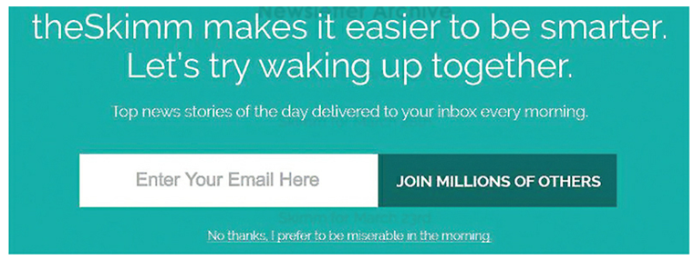
Lawful/Harmful: Working just within the bounds of the law and causes harm to a user. For example, this could be betting apps that have highly tuned patterns that prey on people’s addictive natures or the exploitation of other human attributes like the below example of “guilt-shaming”. Or it could be a pattern that starts out with the best intentions but it is later discovered that they have harmful consequences; for example, Instagram’s and Facebook’s infinite scroll or the slot machine effect caused by notification dots.
Neutral/Good: A Neutral/Good character views “… law and chaos as merely tools to use in bringing life, happiness, and prosperity to all deserving creatures”. For example, apps that take the friction out of donating to charities. Or apps that use the manipulation of mental models for good; for example, the gamification and reward system that has been successfully used in Duolingo.
Neutral/Harmful: A Neutral/Harmful character trait is one where, “She sheds no tears for those she kills, whether for profit, sport, or convenience. She has no love of order and holds no illusion that following laws, traditions, or codes would make her any better or more noble.”
Neutral/Harmful is where a Dark Pattern would sit. The employer of Dark Patterns does so by manipulating common patterns to trick users into doing something they didn’t intend to do.
Why is this Neutral/Harmful and not Chaotic/Harmful? Something that is Neutral/Harmful is self-interested but still obeys some sort of law, such as skirting around what is legal (for example, the changes in language by TurboTax) to make it seem like their service is free. At a component level, it is the manipulation of a user’s mental model to misdirect them to signing up for a newsletter they don’t want or making it difficult to unsubscribe from a service.
To be Chaotic is to not just have complete disregard for any laws but to actively disrupt them and to generally cause nuisance, which is the motivation of many hackers.
Chaotic/Good: To describe someone who is Chaotic/Good they believe, “Law, order, social forms, and anything else which tends to restrict or abridge individual freedom is wrong, and each individual is capable of achieving self-realization and prosperity through themself.”
“In this character’s opinion, any laws, social structures, or other such hierarchies that restrict his freedom are abhorrent and to be done away with.”
I would interpret this as instances where the use of a pattern has another benefit that may or not be known to the user. For example, in the early days of Captcha it was being used to train Google’s AI to more efficiently translate the Google Books Archive.
Chaotic/Neutral: Again not an easy one to fill, according to its definition: “Represents true freedom from both society’s restrictions and a do-gooder’s zeal.” This alignment is very self-interested and has such a disregard for the rules that this character would make things up to suit themselves. If we were to apply this to product design it would be akin to patterns that force a user to do something rather than to trick them. Some examples of this might be seeing a message in Facebook from Facebook Messenger and forcing the user to open it in Messenger or perhaps the Microsoft Suite where a company buys a bundle of products and users are forced to use them to fit into the ecosystem.
What we are left with is a chart that plots out a continuum of alignments and can be used to measure a product’s moral standing against others. It could be used to gauge whether an existing product is something that you would want to use personally or it could be used during development to test a product’s potential harm.
Creating a Design Alignment Chart
Design Alignment Chart
| Law vs Chaos | ||||
| Lawful | Neutral | Chaotic | ||
| Good Vs. Harmful | Good | Lawful/Good |
Neutral/Good
Duolingo |
Chaotic/Good
Captcha |
| Neutral |
Lawful/Neutral
Site navigation |
Neutral
Navigation UI |
Chaotic/Neutral
Forced use of ecosystem |
|
| Harmful |
Lawful/Harmful
Infinite scroll |
Neutral/Harmful
Dark Patterns |
Chaotic/Harmful
Phishing emails |
|
So how did we end up here? I acknowledge that the definitions are complex which makes it quite hard to marry up an example. The goal was primarily as a thought exercise to help us think about the close connection between good persuasive design and bad manipulative design and everything in between.
Good communication design cannot eventuate without some sort of persuasiveness; this in turn aids the user through making the experience intuitive and it aids the business by increasing the amount of returning eyeballs. The problems start to arise when you use human psychology to incrementally tweak the persuasive elements to the point of being manipulative.
Manipulative patterns and media are something that we have to live with and they will only become more indistinguishable with the rise of technologies such as Deepfake. As consumers we need to take steps to be informed. As good social citizens we naturally make sure that our designs and products do no harm but we do need to pause every now and again, take a step back and look at the impact of all our decisions.