In Part 1 of this blog, I will be exploring the definition of good and bad design. Later in Part 2, I will look at using a tool borrowed from the tabletop game Dungeons and Dragons may help us take a step back and spend a little more time thinking about a design pattern, and where it may fall on the design morality spectrum.
Section 1: Reflecting on good and bad design.
Section 2: Intuitive design, what is it and bending mental models
Section 3: The rise of the Dark Pattern
Section 1: Reflecting on good and bad design
How can we distinguish between good and bad design? Good design lets you complete your digital tasks with ease by making choices instinctive. Bad design sometimes confuses you, or overloads you with competing elements and causes you to bounce. If a design has problems guiding you through a goal-orientated online flow, it is not a good design. If the design uses deception or manipulative techniques to get you through the flow, it can still be good design, just not morally good.
I argue that sometimes the good mechanisms can overlap into the harmful and are even used against us in practices such as ‘Dark Patterns’. The maliciousness of Dark Patterns comes from the fact that they knowingly use our assumptions of how the internet works against us.
An example Dark Pattern is one coined by Harry Brignall known as “The Roach Motel.” This is a practice of getting you into a situation that is very difficult to get out of. It may feel like bad design when you can’t unsubscribe from a subscription, however this is sometimes intentional and the designers would rather have you trapped in something that feels like an Ikea simulation.
At the good end of the spectrum, patterns are used to persuade us to complete tasks. We are comfortable with this persuasion because it comes under the guise of intuitiveness and usability. All that separates the two ends is intention. Did the pattern intend to deceive or did it at some point start to drift into a gray area? A check-out experience intends for you to buy what you came for; but is it a Dark Pattern when the design makes you subconsciously add other items to your shopping cart? Or is it just a prudent business practice? It may not be Dark but it is certainly Gray.

A website’s aesthetics also become a deciding factor in its usability. A website with a beautiful aesthetic will evoke a sense of pleasure while using it. A user is more likely to forgive mild usability annoyances if they feel that the website is attractive (NN Group). Therefore, the look and feel of a website asserts some sort of persuasive pressure and becomes tightly bound to the ease of use.
A product that is easy to use is going to be used repeatedly and this experience, good or bad, is attributed to how we feel about the brand we are transacting with. The effect on brands is twofold: the product creates good will for the brand by creating a pleasant customer experience, and they also increase revenue by creating returning customers. Is it bad that good design makes you spend more money?
Getting to the end of a checkout experience smoothly is one of life’s modern pleasures. But when you got there, did your cart hold only the items you were looking for, or had something crept in that wasn’t really on your list? Did you notice “three people are viewing this item” or was there a “low in stock” notification? You may not have been feeling manipulated but you were definitely persuaded by the conscious application of a persuasion technique.
As consumers and as designers, we need tools to help us define the boundaries of where persuasion starts to become manipulation. In his book Hooked, How to Build Habit-Forming Products, Nir Eyal explains the steps of using techniques like “intrinsic motivations” and “variable rewards” to make the use of an app or product habitual.
Later in this article, we will look at Nir Eyal’s four-panel matrix of how to judge the moral positioning of a product. I attempt to expand on this idea using the Alignment Chart borrowed from the tabletop game Dungeons & Dragons. The Alignment Chart helps players define the moral standpoint of their character and defines a murky moral continuum into discrete chunks. I will explain how this tool could be used to map out design practices and patterns.

Section 2: Intuitive design, what is it and bending mental models
The job of a UX designer is to help people understand technology and complete a task with as little friction as possible, at the same time working with technological restraints and a business’s needs.
We do this by creating designs that are intuitive and easy to use. By ‘intuitive’ we mean that we want people to make decisions when interacting with our products with as little conscious effort as possible.
Intuitive to a user or customer means that they don’t need to use much of their cognitive processing power to achieve their goals. When a product is designed well, it follows known design patterns and it fits nicely with a user’s mental model of how they think the product should work.
This is not by accident. As designers of digital products, we tap into an existing knowledge of tested patterns; for example, buttons with a call-to-action are often located at the bottom right of a screen and menu items always start at the top left.
These are now common patterns that people have become accustomed to from long-term use of websites and apps, and through modelling of a user’s behaviour.
We use this modelling to dig deep into the user’s understanding and expectations of a product so that we can take the grit out of the friction points. This can make the experience enjoyable and, when done well, invisible.
For retail products, this improves the repeat use and improves the chance of completed sales. To get to this point, a designer has to go through multiple rounds of discovery, interviews, user testing and iteration to develop and adjust the designs so that they adhere to the user’s mental model.
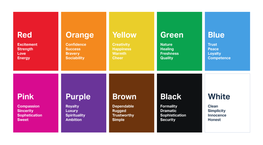
The designer will use different techniques and design tools to help smooth out the process. These might include using colour theory where the designer will use colours in accordance with human subconscious and cultural cues. For example, red often means there has been an error or to pay special attention, and green means a task was successfully completed.
Designers also use white space to remove unnecessary visual noise. This draws attention to the call-to-action, thus gently nudging or persuading a user towards a desired outcome or to complete a desired task. We also get the same result on a page that has clear visual hierarchy where competing messaging is toned down so that the focus is on the desired call-to-action.
All of these techniques help to reduce the anxiety of decision making and render the user experience more enjoyable, or as previously mentioned – invisible.
Persuasiveness
The examples provided thus far demonstrate how we can use people’s behaviour and psychological techniques to influence users’ choices when they use a website or app.
They are somewhat innocuous in that there is little or no deception. We are just using good design practices and these practices are persuasive. But is persuasion all that bad?
We are social animals and therefore influence is an inherent part of our makeup. We may need to persuade a friend after a breakup that it would be a bad idea to go back. There doesn’t seem to be anything morally wrong with this type of influence. In fact, you have your friend’s best interests at heart but what if you were doing it out of jealousy?
It is endemic to the human condition that we influence each other in all sorts of ways besides pure rational persuasion. Sometimes, these influences improve the other person’s decision-making situation by leading her to believe, doubt, feel or pay attention to the right things; sometimes, they degrade decision-making by leading her to believe, doubt, feel or pay attention to the wrong things. But manipulation involves deliberately using such influences to hamper a person’s ability to make the right decision – that is the essential immorality of manipulation.
Persuasion is a necessary part of life and a necessary part of successful product design. The problem arises when the persuasive techniques morph into the harmful and manipulative.
If we look back in time we can see that there has always been some sort of persuasive communication technique used for the trading of goods and services.
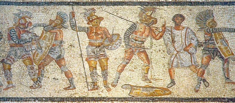
Advertisements found in Pompeii in 265 BC announce that large numbers of gladiators will be fighting in the next show. To the punter, this meant a generous sponsor and therefore a more blood-thirsty spectacle.
Fast-forward to the 20th century and advertising Mad Men of Madison Avenue were crafting language and targeting audiences to make products attractive and stand out from dozens of similar ones.
Are we as designers using a user’s own knowledge against them to quickly and repeatedly achieve commercial goals? Or are we creating an experience that is low in friction because we want our users to complete their tasks with little effort? These are not mutually exclusive as the ease of use and the development of practices that get us hooked, and at times addicted, are the same ones that often make the product or app enjoyable to use. There is a lot of crossover and at times it is quite unclear where manipulation starts and when it is just a good design doing its job.
Section 3: The rise of the Dark Pattern
So far we have considered the different approaches of how design and communication are used to persuade – for example, using design to emphasise a call-to-action – and we can see how modern communication practices can drift from persuasive through to manipulative.
A recent phenomenon recognised in digital media is the rise of the Dark Pattern; that is:
…tricks used in websites and apps that make you do things that you didn’t mean to. – Harry Brignul
Nefarious communication practices have been around since people could talk. With Dark Patterns, we see how people have extended this into the modern world with practices specific to the digital realm. Unscrupulous designers, often governed by equally unscrupulous marketing departments, use knowledge of digital patterns and prey on a user’s mental model to trick people into making them do something they didn’t mean to.

However, some harmful patterns are not always intentional. The badge notifications that wink at you from the top of your app icon are an economical way of telling you that someone liked, mentioned or shared something about you. The unintended consequence is that they turn your phone into a ‘slot machine’. Every time we look at our phones, we are falling for an addictive slot machine mechanic. As Tristan Harris explains:
You pull a lever and immediately receive either an enticing reward (a match, a prize!) or nothing. Addictiveness is maximised when the rate of reward is most variable.
We can presume that well-intending designers did not initially want the phone to work like a slot machine, but the usage metrics would have come back as very favourable so the design pattern stuck. However, like many unintentional discoveries, these findings have been observed and consciously put to use.
In Nir Eyal’s book Hooked, he explains how this slot machine mechanic is a useful way to build a habit-forming practice called “variable reward,” and can be used with a suite of other techniques to build habit-forming applications.
We have to ask ourselves: “When does the application of these design practices start to become harmful to our users?”
Can design be neutral?
It’s all a rich tapestry
Communication design is a continuum of morality. Design can start from a morally neutral point. A street sign is designed to help us orientate ourselves; its font and colour contrast make it easy to read. It doesn’t care about your decision, it simply has a firm suggestion.
Good interactive design is somewhat neutral in that the white space and judicious use of colour and language are guiding you to a destination. What sets it apart from a street sign is that it often comes with an agenda. For example, ASOS needs you to find your way to the check-out easily. It does this by remembering your login details, suggesting other items you might like and by reducing the friction of returning an item. A great experience for the customer and increased sales for ASOS, a win-win for both parties. There is little or no deception here but there is some form of strong persuasion.
Eyal looks deeper into these techniques. For example, returning customers are hooked with the application of triggers (these could be internal and could be causing anxiety due to keeping up with trends), variable rewards (suggestions based on your browsing) and investment in the product (Instagram posts featured on the site of you wearing your latest purchases).
These patterns are not bad or dark; however, I suggest that they are borderline manipulative and take some of the agency away from the user.
A commercial website cannot be neutral like a “Give Way” sign. How would it make any money? Perhaps it could be a catalogue of images with a price at the bottom and a phone number to call if you are interested. That would be about as neutral as you could get but it would be a long time before the company turned a profit.
So how do we recognise when a business’s need to persuade becomes manipulation? And what are some tools that can help recognise when this happens?
A designer’s job is to create products that communicate. A designer must understand the needs of the users that they are designing for and that those needs that may not be the same as theirs. A designer must also have an equal understanding of the commercial aspect of the app and successfully answer the business’s needs.
The needs of the customer and those of the business are sometimes in conflict and the path to profitability for a product may include harmful and deceptive practices. However, it shouldn’t have to be this way.
In the second part of this exploration, I will be looking at some of the tools and perspectives that have been used to help us define our position as designers and the products we make. I will introduce another tool – The Design Alignment Chart – that may help us gain an overview of how designs might fit in a spectrum between persuasiveness and manipulation.